Occasionally in school, a teacher might require a handout as one of the course assignments. Typically the handout is done as an accompaniment to a research paper or presentation that you can share with other students in the course.
Making short handouts at the end of a research project is very helpful.
Reducing a 10-page research paper with 15 sources down to a one-page handout requires processing and refining the information in a way that helps students make more connections.
As I identify the core nuts and bolts of my thesis and support, I can refine and digest the research I spent weeks finding.

For visual thinkers like me, the extra step of creating a handout is an opportunity to convert a mass of information into a visual format that is easier to remember. Presenting your handout in a visually rich format also helps the reader- the reader will likely spend just a few minutes processing the information you spent weeks researching. Whether you are a student or a professional researcher, communicating effectively to this audience requires a little bit of creativity to help them identify your thesis, support, and key points in a format that is engaging and makes sense.
This article in two parts:
- Part 1: How to locate your important information visually, and
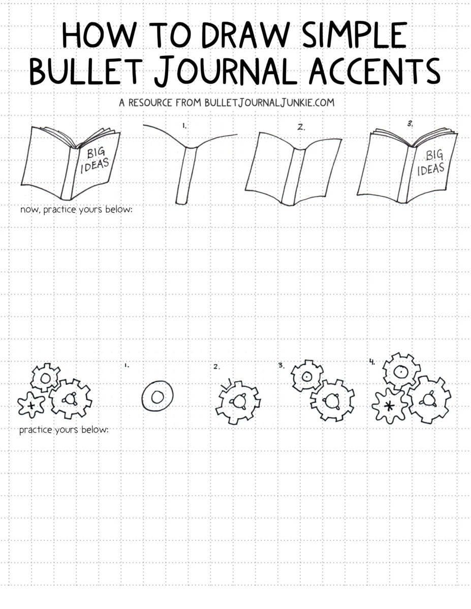
- Part 2: Practical tips on blending text and doodles with a professional but engaging layout (click here jump to a free download on how to draw bullet journal doodles!).
Step 1 of 2: Translating your Research into a Visual Handout

Whether you are a student, teacher, or professional researcher, it can be tempting to prepare your handout by simply summarizing or outlining your prior written work. Unfortunately, this does not usually translate into an easily readable format- and if your handout is challenging to read, it’s unlikely it will be read entirely and understood by others. For students, this matters for grades, but for teachers, researchers, or professionals, the stakes may be much higher- engaging our audience and communicating well is vital for good learning outcomes, grants, and future promotions at work.
Translating your research into a visual structure is vital. You may discover your own method for translation, but I use mind mapping to locate the key points. Often I’ve drafted my paper as a mind map, but usually change course and adapt to finding mid-way through the paper, so to create a handout, I go back through my research paper and mind map my actual paper.
In my map, I ask and answer these questions:
- What is my thesis?
- What points support my thesis?
- What’s my conclusion?
- What are the simple, actionable consequences of this research (i.e., why does it matter?)
- How is my information related to other information?
- Where are these points interconnected?
As I ask and answer these questions, a messy mind map usually forms, and out of that map, a general structure I can carry into Step 2 of my handout creation process.
Step 2 of 2: How to Create your Handout
Turning your visual representation of data into an engaging handout requires a few more steps.
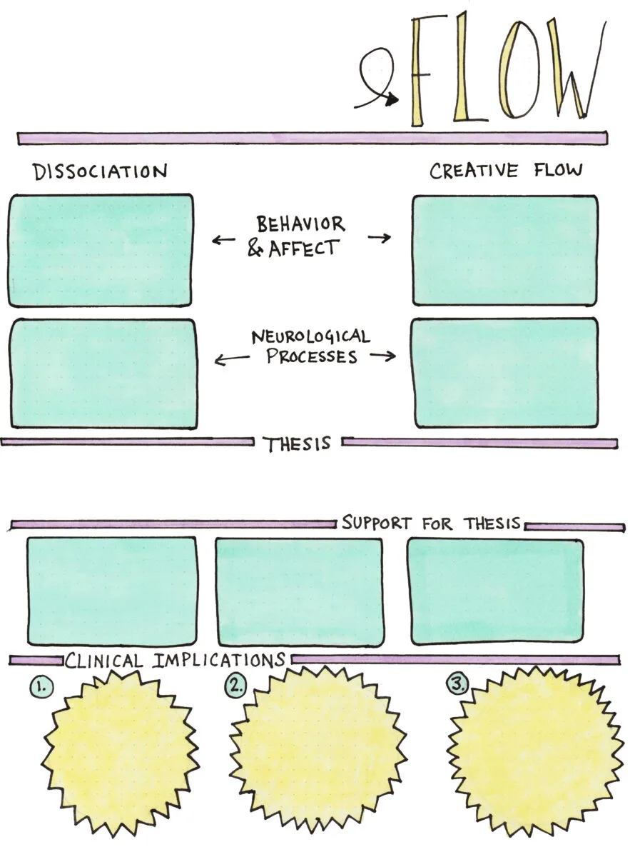
I’ll demonstrate by using the example of a handout I prepared based on a grad school research paper exploring the relationship between creative flow and pathological dissociation.
After I completed my post-paper mind map, I had a pretty good visual representation of how my information presented itself, so I began to doodle the structure and background of my handout:

In my opinion, it creates a more polished product if only the background, not the text, is created by hand. Digital fonts make a more readable final product, no matter how precise your penmanship is, but the background doodles help illustrate for the reader what is important and why.
Hand-Drawn to Digital
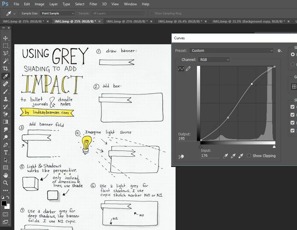
But it doesn’t look like the image above when I first scan the completed page. It takes some editing to get my page from hand-drawn to digital-ready. In the photo below, I demonstrate (with another hand-drawn bullet journal style handout) how I use Photoshop’s curves to clear my background and bring my black lines up to a high contrast of true black.
If you don’t have Photoshop, you can probably achieve the same results with alternative software. You’ll need to play around with brightness, contrast, and exposure.

Once the background is truly white, and my lines and fill are solid and to my liking (I sometimes tweak color using color balance, at this point), I save the image as a jpeg.
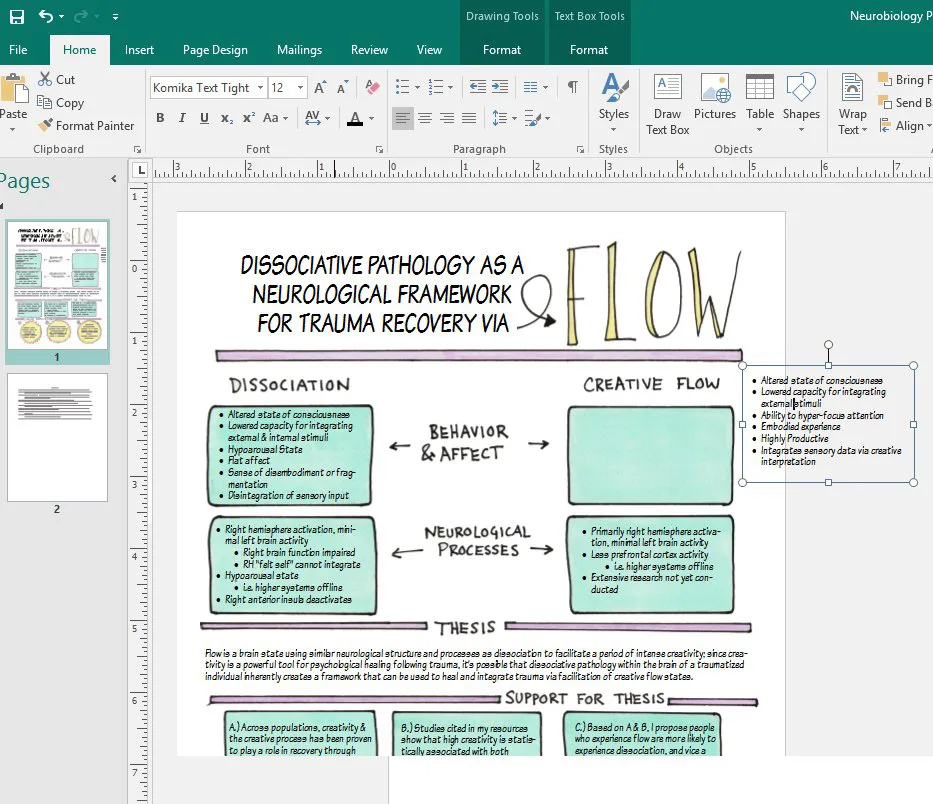
Next, I start working in Microsoft Publisher. In publisher, I open a new file and Insert my jpg into a new 1-page document. I push the jpg to the background and begin drawing text boxes over the hand-drawn boxes. The text boxes allow me to add letting in a uniform font, as shown below:

As shown below, I continue adding text boxes until my handout is populated and completed. Keeping the text digital and design hand-drawn helps the final product look visually exciting and professional.

