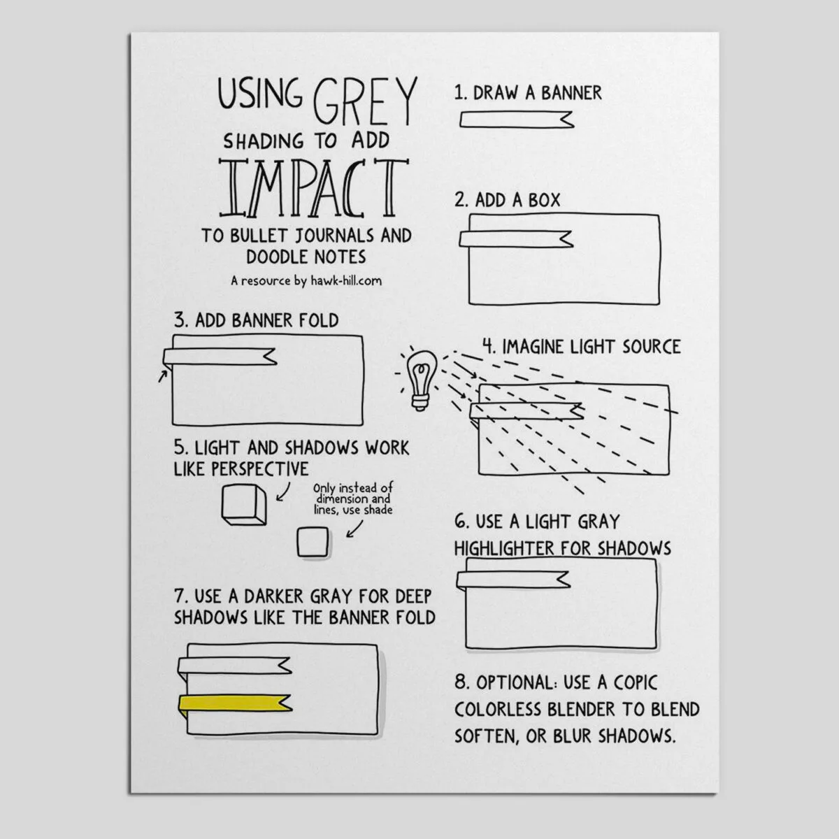
In this post you’ll learn step by step how to use a simple shadow drawing technique to make your bullet jounal elements pop off the page! Keep reading to follow step by step or download the free one-page instructional handout.
When I first began using a bullet journal I experimented with using lots of colors and varying pen styles. I didn’t do much shading. I found through trial and error that the more color on the page, the more overwhelming my journal pages were when I went back to study them.
Over time, I’ve found my style is to use one or two multiliner nib sizes, 2-3 marker colors, and 3-4 matched shades of grey. Since drawing grey shadows with markers is a technique unfamiliar to most, I’ve written this post as a tutorial to get you started.

Grey shading one of my best bullet journal tips to add depth and interest to your bullet journal layout. Once you have the right supplies and get the hang of it, it’s quick, easy, and really adds a “wow” factor to creative class notes and bullet journals.
The following section may contain affiliate links. As an Amazon Associate, we earn from qualifying purchases.
Supply List for Drawing Grey Marker Shading
I use four markers in this tutorial, although a simple grey mildliner highlighter works if you’re on a budget. Copics are my go-to, but art markers aren’t a great fit for a student budget. For a cheaper option, try the Zebra MildLiner in Grey (essentially, a grey highlighter available for a few bucks). Though it doesn’t blend, it works fine for creating basic drop-shadows. Experiment with this grey highlighter and crosshatching for a shaded gradient effect.
A N0 Copic Sketch Marker, a N1 Copic Sketch, and a N2 Copic Sketch Marker as well as a Copic Colorless Blender. Copic pens aren’t cheap- but I’ve tested a few grey highlighters and I have not found a substitute for that blends like Copics. The good news is that Copic’s have replaceable nibs and replaceable ink so, theoretically, they will last forever. (I currently have markers in my collection that are 10 years old and, with refills, still going strong)
Using Grey Copic Markers?
The “N” in the color name/number above indicates they are a neutral tones of grey (rather than the bluish cool tones, or reddish yellow warm tones of grey). You can create a slightly different effect with the other colors, but unless you are a professional comic or portrait artist, the neutral grey highlighter markers are more than enough for the average journaler or note taker.
Step by Step Instructions to Shade Notes with Grey Markers:
These step-by-step instructions are also available via this free one-page reference printable PDF below. It’s sized perfectly to tuck between the pages of your bullet journal for reference on how to shade elements on a page.
Download a PDF of this Printable Resource
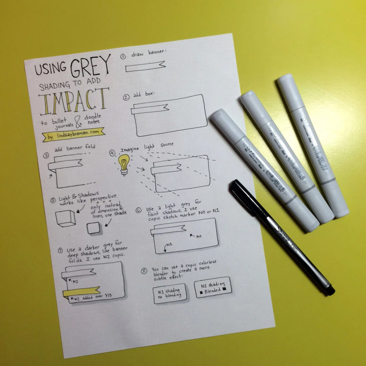
Step-by-step guide to drawing shaded boxes and banners.
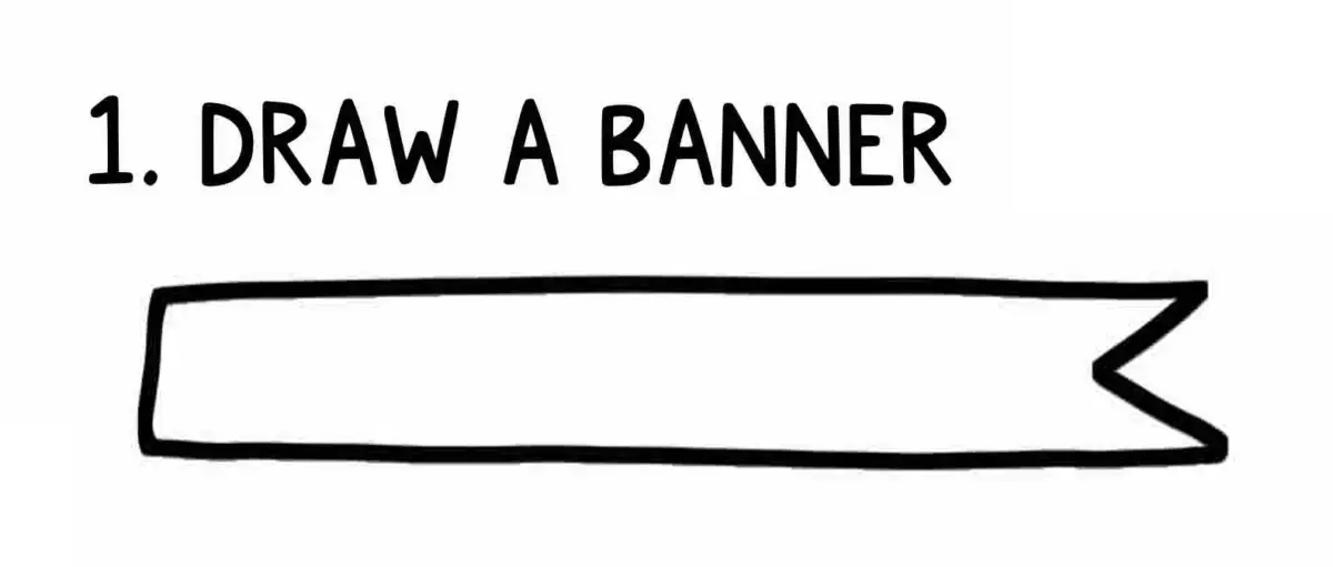
Draw a simple flag-style banner.
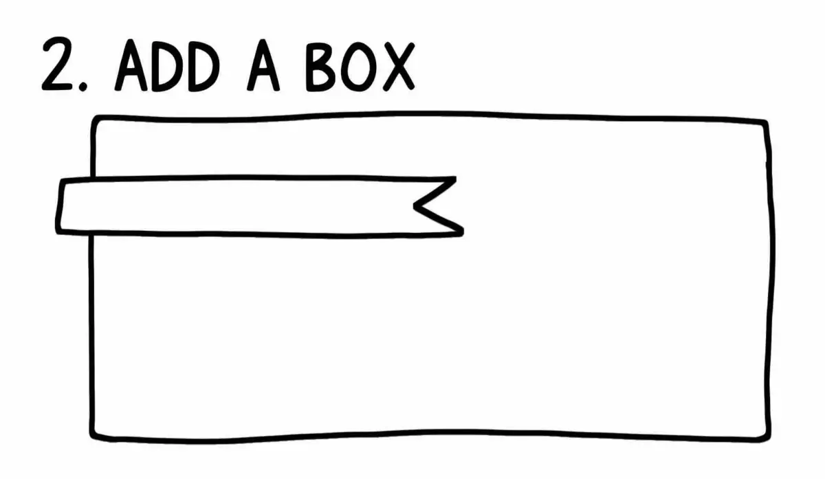
Add a box “behind” the strip of banner. Your banner is “in front” of the box, but without shading our eyes don’t recognize that third dimension.
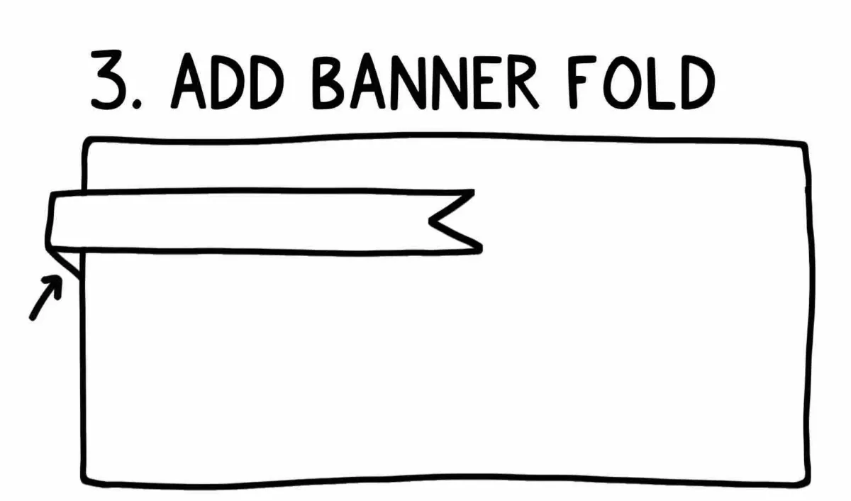
Add a banner fold. This adds a 3-D perspective that is enhanced with shading.
Visualize where your light source is. I happen to always envision the light coming from the upper left corner of the page, keeping it consistent makes shading predictably easy.
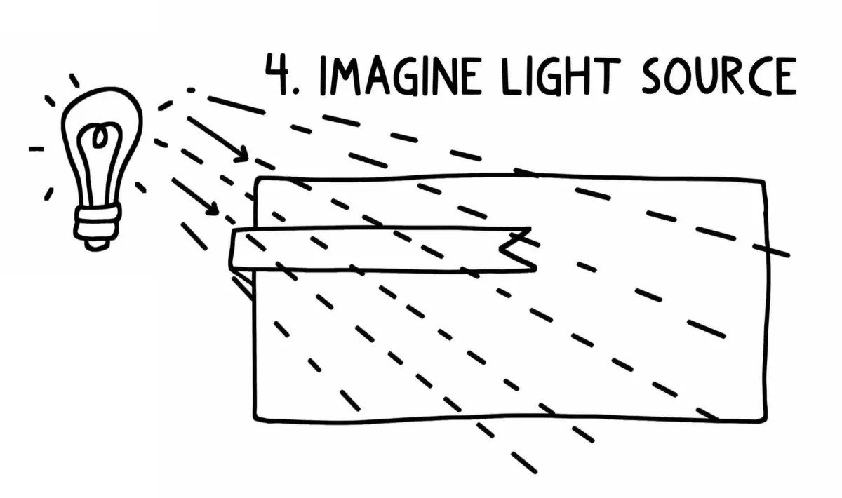
Imagine perspective. Light and shadow works like perspective. (For a refresher on drawing perspective, check out this instructable)
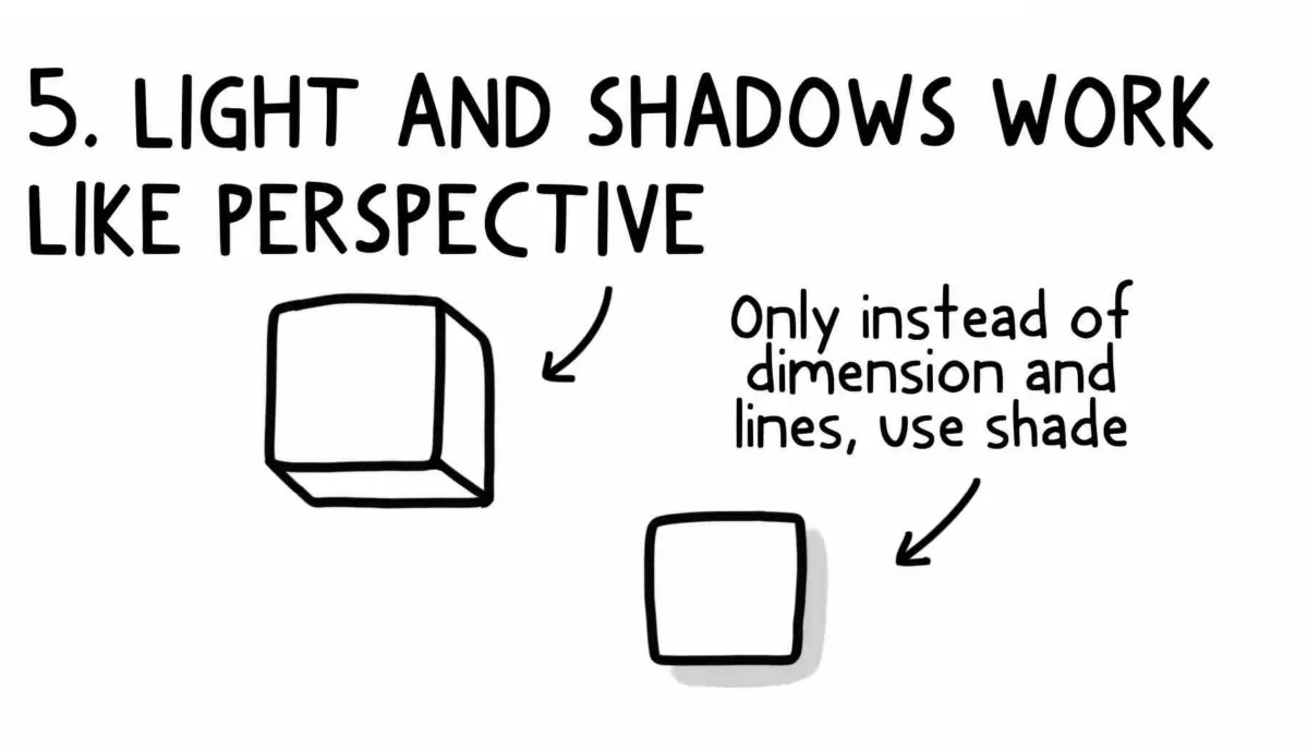
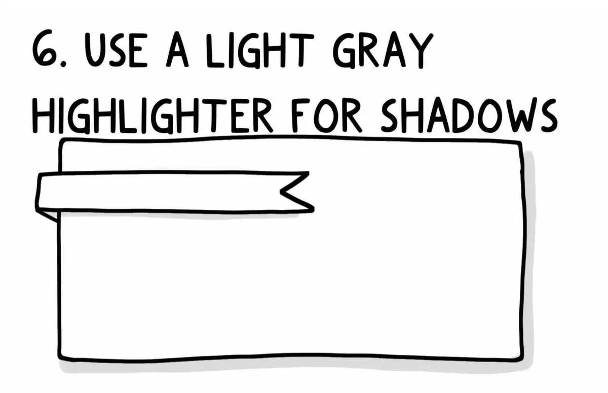
Add shadows where perspective would show the sides if the box was three dimensional. – Notice how my use of the N0 marker behind the banner makes the banner appear to be sitting right on top of the box, but the N1 shading behind the box, which is a little darker, gives the impression that the box is floating with nothing behind it.
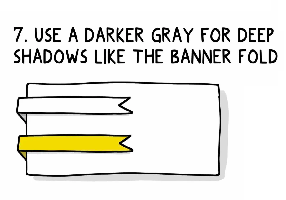
Color deep shadows, like the fold of a banner, with a darker grey, I use N2. A cool thing about Copic markers is that they can be layered with other alcohol based markers. Here I layer N2 and Y13 to create a deeply shaded yellow backside of a Y13 colored banner.
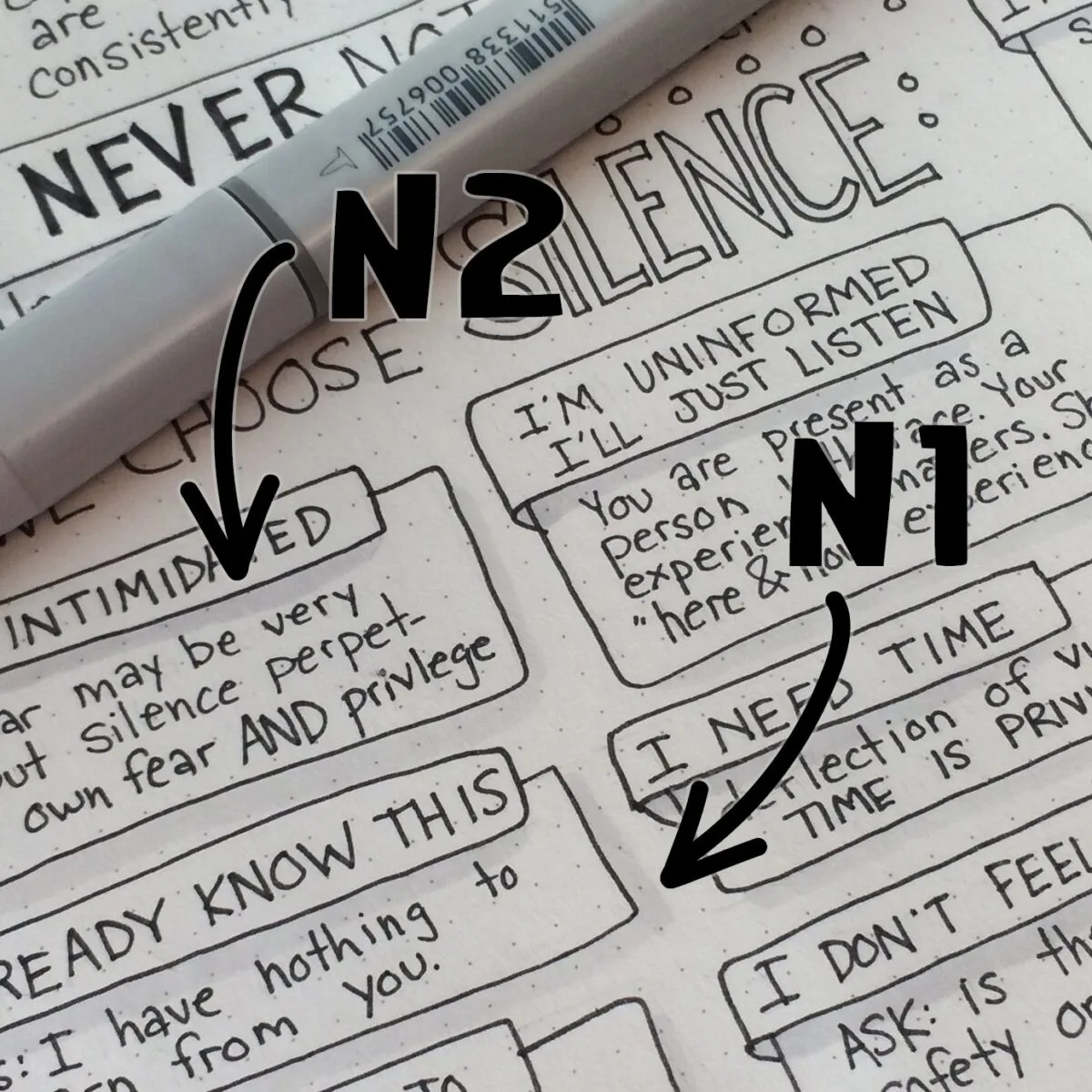
(Optional) If your shading feels like too much, or got a little darker than you’d like, you can use the colorless blender to smooth the effect. Be careful with the colorless blender, however, as it can sometimes “push” color into uncolored spaces. Don’t worry: once you’ve used it a bit you’ll get the hang of controlling it.
That’s it! It may take some practice learning to convert perspective to shadows, but it’s an easy trick to add “wow” to your notes. Check out how a little shading around this banner really draws the eye to what’s important on the page, without any use of color:
Shading can be done with one marker (I’d recommend the N1 or the N2) but multiple shades of grey add depth, like in the image below:
Tips for Adding Grey Shadows in a Bullet Journal
One of the most important aspects of bullet journaling is creating shadows and shading. This can be done with any highlighter, but grey highlighters are especially effective. Here are some tips on how to create shadows and shading in your bullet journal:
Use different tones of grey.
The lighter the grey, the more subtle the shadow. The darker the grey, the more pronounced the shadow. The lightest grey creates a very subtle shadow, while the darkest grey creates a more pronounced shadow. In between, there are a range of grey shades that can create different kinds of shadows.

For example, a light grey may create a shadow that is barely visible, while a darker grey may create a shadow that is more defined. The different levels of grey can be used to create different effects in a painting or drawing. For instance, if you want to create a sense of depth, you may use a light grey for the foreground and a darker grey for the background. Or, if you want to create a sense of drama, you may use a dark grey for the foreground and a light grey for the background.
Experiment with different widths of strokes.
Once you have an idea of what you want, start experimenting with different widths of strokes. Thin strokes will create a more delicate shadow, while thicker strokes will create a more bold shadow. Neutral colors can create different shades of shadows, while bolder colors will create more defined shadows. Try different colors to see what works best for your project. Creating shadows can add depth and dimension to your design. By playing with different widths, colors, and intensities, you can create a unique and eye-catching shadow effect.
Create shadows by gently pressing the highlighter onto the paper.
One way to add depth and interest to a drawing is to create shadows. This can be done by gently pressing a highlighter onto the paper. With some brands of grey highlighters, the harder you press, the more ink will saturate and the darker the shadow will be. By using different pressure and angles, you can create a variety of shadows that can really bring your drawing to life.
Shadow Slowly.
To add shadows to bullet journal drawings, start with a light grey highlighter and gradually add darker shades of grey. This will create a gradient effect. When done correctly, shading can make a drawing come to life. There are many different ways to shade but I like to start with faint shadows and gradually build them deeper with darker colors.
Experiment.
Get creative with your shadows and shading! There are no rules, so have fun and see what looks best.

