In this post I demonstrate step by step how I create a banner with folds and shading.
For step-by-step instructions slowed down and broken into bite size pieces- keep reading.
A banner can really add some pizazz to a journal and make it more personal. Here’s how I draw a banner in my journal:


First, I decide on the size of the banner. Next, I sketch out the basic shape of the banner. I usually make a simple rectangle. Then, I start decorating the banner. I love adding shadow to my bullet journal art (so much so that I made a whole post about it). Finally, I add any finishing touches, like shading or highlights. And that’s it! A simple banner can really make a journal more fun and unique.
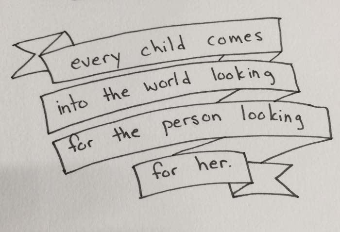
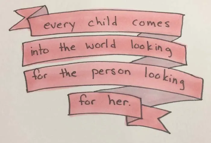
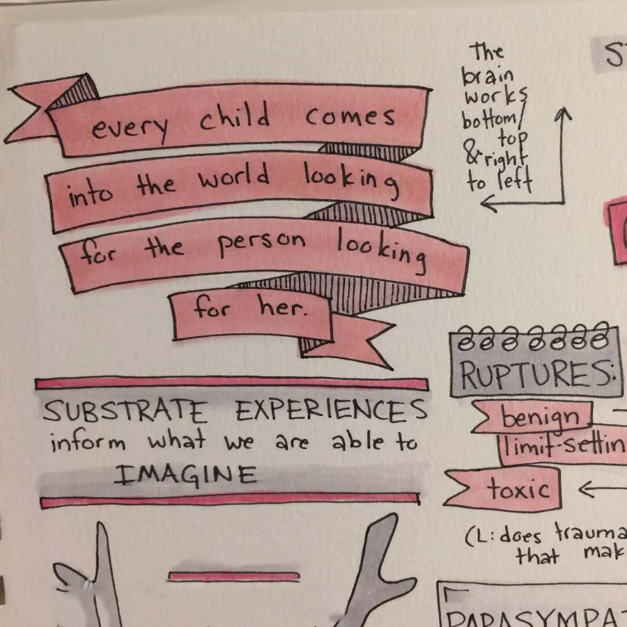
When Curt Thompson said this quote at an event I attended in Seattle, I loved it and knew I wanted to visually emphasize it in my notes. Knowing that, I carefully spaced the words in well-spaced lines, which would allow me to go back and embellish later. Here’s that first step:
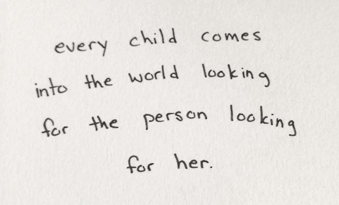
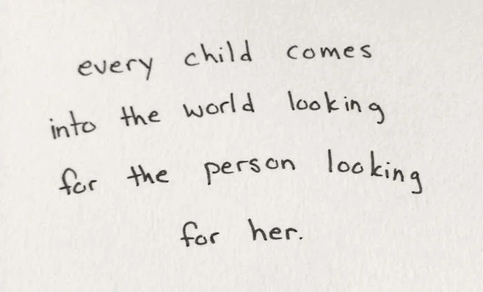
Once I’ve captured the quote, I have the freedom to move on, or to go ahead and embellish the text into a banner. Usually, to help me gauge spacing better, I at least go ahead and do a rough outline of how I’ll embellish the text.
Frequently Asked Question: “How do you make bullet journal style notes while keeping up with the teacher?”
Answer: With practice, I’ve learned how to space my words and lettering so I can write down a simple statement, then come back and embellish when the speaker is answering questions or telling stories.
Since a good speaker balances lecturing, telling stories or sharing illustrations, and answering questions, in most of my courses this method works really well.
For a banner, this starts with drawing a rectangle outline around each line of text. I like my doodle method because the irregularity of shapes becomes part of the style.
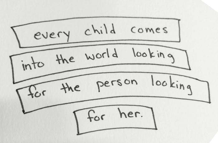
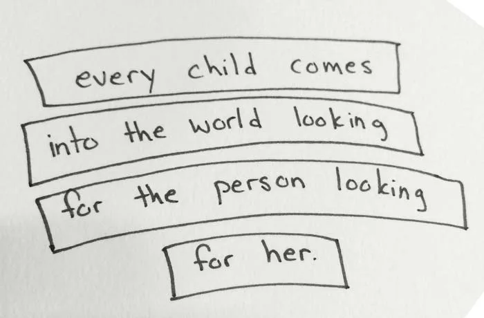
After the rectangles are drawn, I imagine the rectangles as a folded banner, and draw those connecting strips linking each line together in a “continuous” banner.
The following section may contain affiliate links. As an Amazon Associate, we earn from qualifying purchases.
Normally after the banner is drawn I’ll jump to other elements of my notes and return to the details later. When I’m ready to detail, I usually use an N1 Copic Sketch Grey Marker to color the places where visually I want to make it appear that I’m seeing the “back” of the ribbon:
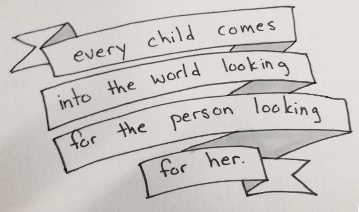
Over the entire thing (including the portion I just colored grey- Copics are designed to layer and blend) I add my color, in this case RV11 – Copic “Pink”.

Next, I use closely spaced black-inked lines to create even more depth- adding texture to the colored shading already added.

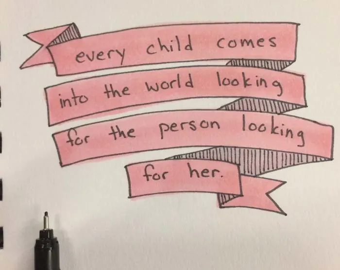
That’s it! Sometimes, like in the video below, I use a *N0 Copic to add shading around the lower left of the outside of the banner, and N2 Copic to create distinct shading on the reverse side of the banner, but I’ll save that instructional for another day (though, if you watch the video below you’ll get a sneak peek at both.)

While I prefer grey Copic markers for grey shading, these illustration markers aren’t a great fit for a student budget. For a cheaper option, try the Zebra MildLiner in Grey (essentially, a grey highlighter available in singles). Though it doesn’t blend, it works perfectly fine for creating basic drop-shadows. Experiment with this grey highlighter and crosshatching for a shaded gradient effect.
Using Ink and Grey Highlighter to Bring Creative Challenge to Coloring Pages
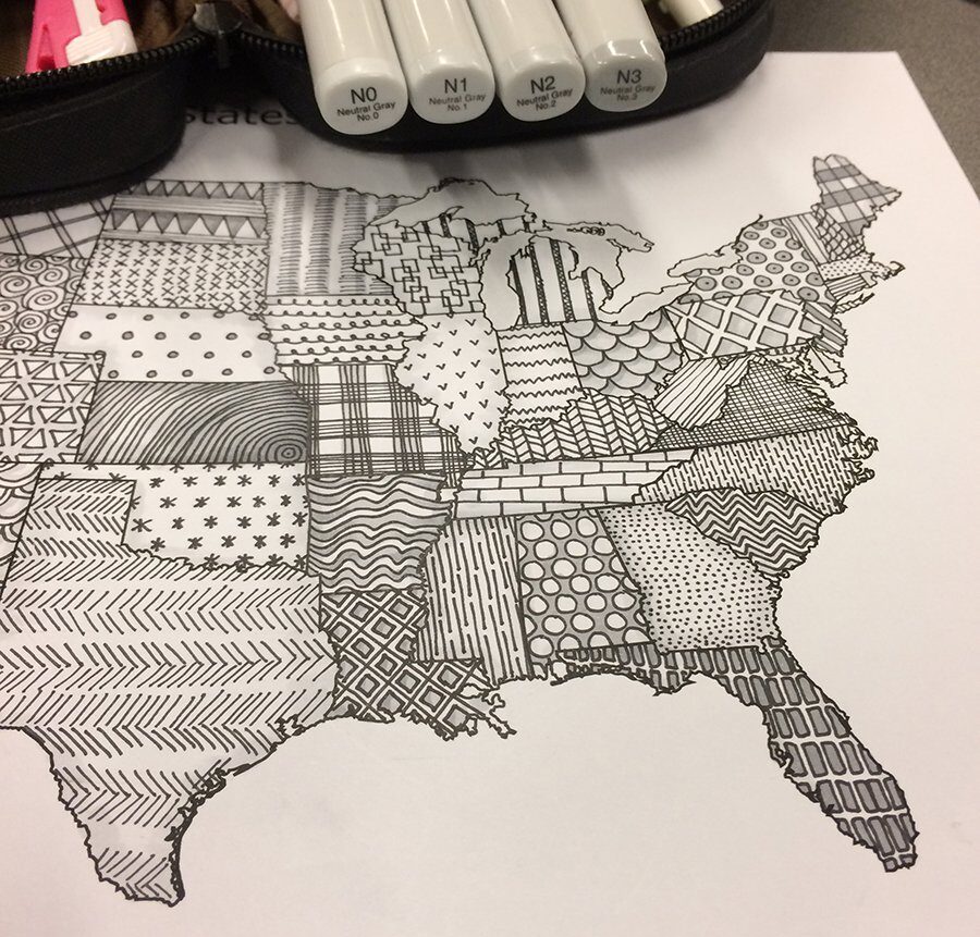
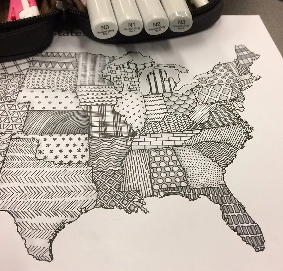
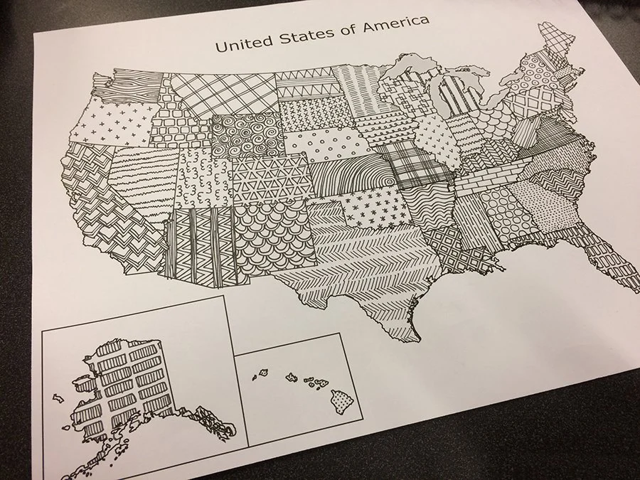
During the 2016 presidential election, my graduate school night class set out coloring book pages of the 50 states of the United States. Though a very kind gesture, I knew that to keep my mind occupied and not-too-anxious through the tension of the long evening, I needed something a little more consuming than filling in blank spaces with solid colors.

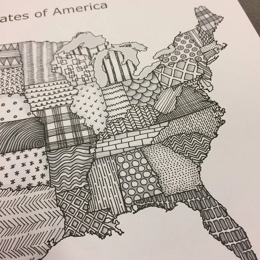
Instead of simply filling in the coloring book page with colored pencil, I used a fine point sharpie pen to create a unique texture or pattern within each state. In the final hour of class I used a set of blendable grey alcohol based grey markers to add depth and shading to my pencil textures. Using a black pen and grey highlighter markers to create this doodle of 50 states created depth and interest without color.
While I love my copics for grey marker shading, these professional illustration markers aren’t in every casual artist’s budget. The set linked above is a non-refillable alternative to grey markers made by copics that are priced for a student budget- but for an even cheaper option, try the grey highlighter made by zebra (essentially, a grey highlighter available). Though it doesn’t blend, it works fine for creating basic drop-shadows. Experiment with a single grey highlighter and crosshatching for a shaded gradient effect.
How to Really Color Mindfully
What is being sold as mindfulness is more often dissociation. Mindfulness is, by definition, a practice of intentional awareness to the body and surroundings, and attunement to what thoughts, feelings, and sensations are found there. Dissociation comes in many forms, but one form of dissociation is becoming lost in an automatic behavior or movement- allowing that behavior to dull our awareness of ourselves and our environment.
The interesting thing is, coloring can be mindful, almost any activity can be done as a mindfulness activity, and mindfulness has HUGE benefits to our emotional and physical health and our ability to do relationships and parenting well, but dissociation has the opposite effect. It’s important, if you use mindfulness coloring books, to learn to use them in a mindful way, simply coloring the pages of a mindfulness coloring book does not create the same results as regular mindfulness practice.
I hope to publish much more on this subject in months to come, but here are a few tips to make sure when you color you are getting the benefits of mindfulness:
1. When you color, only color.
If you are coloring while watching TV, listening to music, or otherwise have your attention split, you won’t be able to be present enough to mindful color.
2. Pay attention to coloring.
Ask yourself as you color: what do you notice? Notice smells, textures, colors, feelings, sounds, etc and sit with those sensations, notice them, enjoy them.
3. Invite Creativity
Filling blank spaces with color can be a difficult task to give your full attention to. Consider more complex patterns, like the ones shown here, which allow you to stay more engaged via creativity but establish boundaries to keep you from wandering too far.
4. Keep it Short
It’s difficult to do mindfulness well for long periods, especially at first. Instead, enjoy short 5-10 minutes of coloring in which you are attentive to the sensations and feelings around coloring in your mindfulness coloring book.

Ink & Grey Highlighter Zen Doodle Prayers
As I carefully penned the detailed pattern in black and white for each state, I found myself praying and mindfully moving through prayers for the state as I spent the 5 to 10 minutes per state carefully creating a texture. As someone who struggles with prayer in the traditional sense but has found it easier to meditate and pray with pen in hand, this didn’t surprise me- but I did appreciate how the structure of the task – filling each state with a tiny inked pattern- structured my prayer.