Tracking your emotions on paper may seem a vague idea, but it is actually achievable. Today, I will introduce you to a layout called “Year in Pixels” so you can easily start assessing your life perspectives and improve your positivity all year round.
Sometime in 2016, I asked myself these questions: “How can you track emotions? Are they even measurable in terms of analog tracking?” I figured it would help me a lot in practicing mindfulness if I can also track how I feel throughout the year. Fortunately, I discovered this layout idea that can help me visualize my emotions. Having benefitted immensely from this practice, I am excited to share with you my insights and tips so you, too, can find joy in it.
In this article, you will:
- learn the significance of tracking your daily emotions
- get a free printable PDF download of the Year in Pixels layout
- instructions on how to use color legends for your chart
- plus tips for personalizing this layout to suit your journal style

What Is “Year in Pixels” All About
“Year in Pixels” is a journaling layout designed to help you visualize your mood in a non-text way. It creatively uses a grid to track your daily emotions, which you will shade accordingly based on the “color” representing your mood for the day. The objective is to create a single picture that sums up your emotional well-being throughout the year.
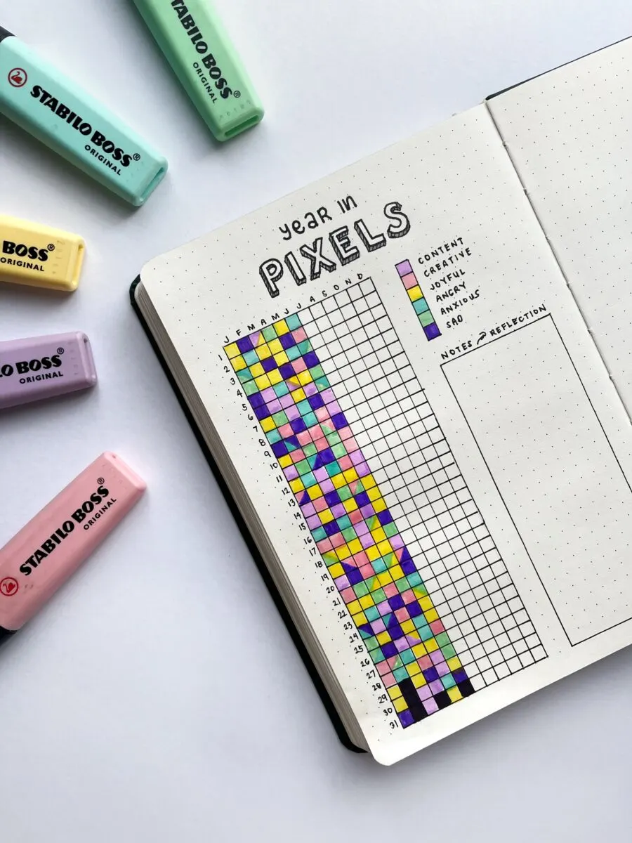
I know you’re curious as to how it earned its layout name. When I finished mine in 2021, I guess I know why. The whole shaded grid resembled a pixelated photo. A fascinating insight is that 70% of the whole grid showed a palette of cotton-candy colors, illustrating that I had been in a content place for most of the year.
Here’s the step-by-step guide to follow in case you prefer to DIY from scratch:
How to Create a Year in Pixels Layout in Your Bullet Journal
Title your tracker.
On top of the tracker, add “Year in Pixels” to distinguish it from all your other trackers/analyzers.
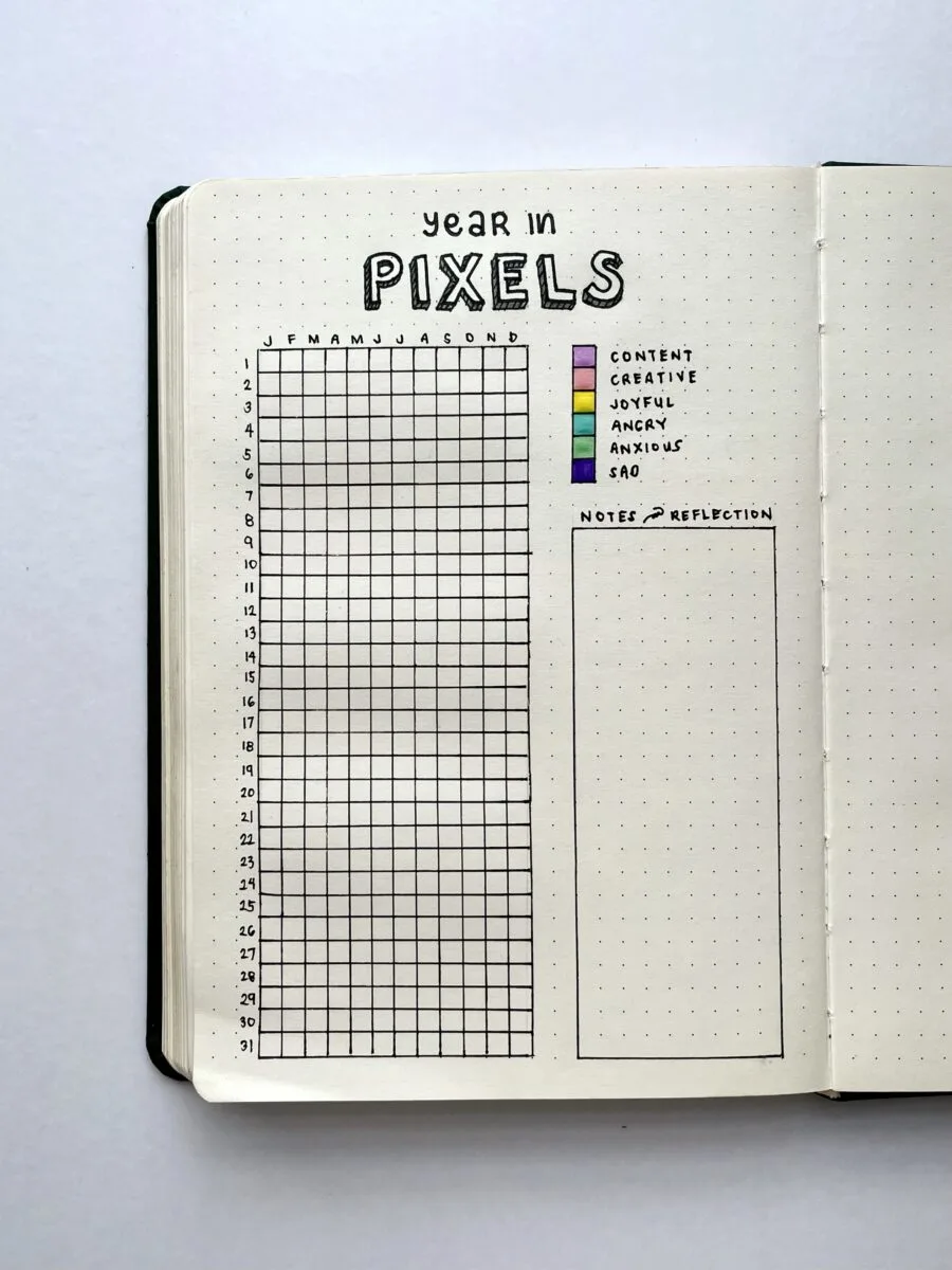
Draw a table covering 12 months of the year and 31 days in a month.
If you’re using a dotted or gridded sheet, connect the dots with a straight line across the page to fit 12 months. Then, following the dotted line down, make enough room for 31 maximum days in a month (in single squares or “pixels”).
Label the first row of squares with the initials of the months and the side of the table with the number of days.
Use uppercase letters for the months (J for January, F for February, and so on). For the days of the months, it doesn’t matter if certain months have fewer than 31 days—better the excess squares than less of it.
Assign a specific color for each mood/emotion.
Again, the colors depend on your preferences. Be mindful of the visual alignment you wish to see as you track your daily emotions.
Write the key next to the tracker.
The number of “emotions” or “moods” you can use is up to you. For me, it’s better to keep them around four to five. This will make the visualization at the end of the year more effective as mood patterns will be visible through colors with similar hues.
Supply:
- Bullet Journal
- Pen
- Ruler
- Colored Pens or Pencils
Main Differences Between Daily/Monthly Mood Trackers and Year in Pixels
Most journal layouts for mood trackers are designed to help people visualize how they felt for a week or a month. With these trackers and charts, you can’t get the whole picture of how your year went by, emotions-wise. What you’ll have instead is a series of rows and columns that illustrate a portion of your overall life perspective.
Some designs of daily mood trackers are labeled with emojis or a symbol to represent the emotions or moods. Others have become more artistic by allowing you to color an illustration (such as a flower, a rainbow, etc.). Hence, they can’t provide you with an illustration of how happy or sad you had been in a particular year.
How Year in Pixels Helps in Tracking Your Emotions
Unlike daily mood logs, Year in Pixels gives you a drone shot of your emotional theme for the year on a single page of your journal. Basically, the colored grid should give you an insight into your habits and thinking that impact your perspective.
I used to see emotions as the resulting feelings of my day-to-day activities and decisions. This went on for years until I realized that some of these emotions were creating a pattern in particular months or seasons. The color shades that almost bled to the neighboring cells revealed this to me. The majority of the “pixels” were rosy, while others look dark.
As such, tracking them using Year in Pixels allowed me to strive for a positive mindset throughout the year. Seeing patterns can actually help you in making sound decisions 1. In my case, the yellow-shaded “pixels” represent my happy days. These further motivated me to engage in serotonin-inducing activities like nature tripping and making art.
And yes, Year in Pixels can also help you steer clear of bad habits and thinking. By seeing the “bigger picture” unfold every day, you can decide to make your day a positive one.

Color Palette As Pixel Legends
Unlike trackers that use emojis and symbols to represent certain moods, the Year in Pixels layout requires you to shade each square according to the color of your current emotion. You can read about the bullet journal markers I recommend in my post on bullet journaling supplies.
There are a few ways to use colors to visualize your year-in-perspective. For instance, you can use warm colors (red, orange, and yellow) to represent positive emotions, such as being happy, grateful, and relaxed.
On the other hand, you can use cooler or darker hues to represent average to negative emotions like feeling confused, irritable, and angry.
I use the following color legends:
- Purple – content
- Pink – creative
- Yellow – joyful
- Light Blue – angry
- Green – anxious
- Navy Blue – sad
I recommend these emotions, as they represent happy and sad emotions evenly, as well as emotions that are spread evenly around an emotion wheel.
The choice of colors to use depends on your preferences. Still, many journal fans prefer to use warm-cool color schemes for better visualization and easier logging.
Download This Free Printable Year in Pixels Layout
Many first-time bullet journalers prefer having a printable PDF of Year in Pixels layout to prevent making mistakes on their journal pages. Whether you’re feeling amateurish or you’re a busy journaler like me, downloading this layout will save you time and effort (and a journal page!).

Variations for Year in Pixels Layout
You can get as creative as you want when it comes to tweaking the layout to accommodate your visualization needs. For instance, if you’re feeling happy about a particular event in the morning yet the evening is capped off by something disappointing, you can divide the square into a diagonally-shaded pixel for that day.
Some people also prefer to switch the place for the months and days on their journal sheets to make the tracker appear in landscape orientation. This should depend on the dimension of your journal notebook.
Other creatives shade their pixels in a gradient-like form to add an interesting visual. They would fill the squares using horizontal, vertical, or diagonal lines.
Final thoughts on using Year in Pixels 2022
Year in Pixels layout is still popular among bullet journalers in 2022 as recent events gave way to the resurgence in analog writing and offline hobbies. Not only does it add to the aesthetics, but also to a better purpose for your mindfulness.
This article proves that emotions are trackable and can contribute to a better disposition in life. By logging your daily mood with a dash of color, you can create a “year in review” without struggling to write down your experiences. The free PDF layout is also yours to either fill up or draw inspiration from!
Image Description for screen readers
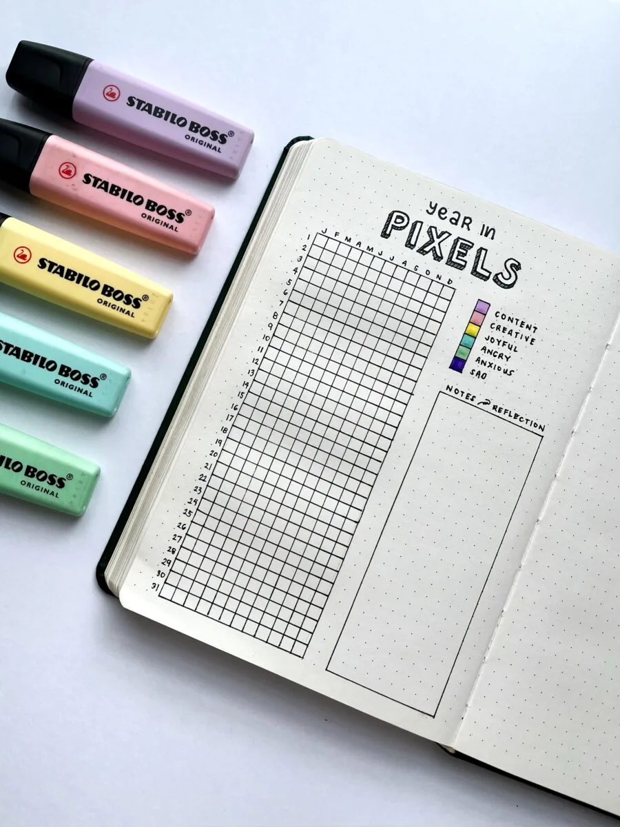
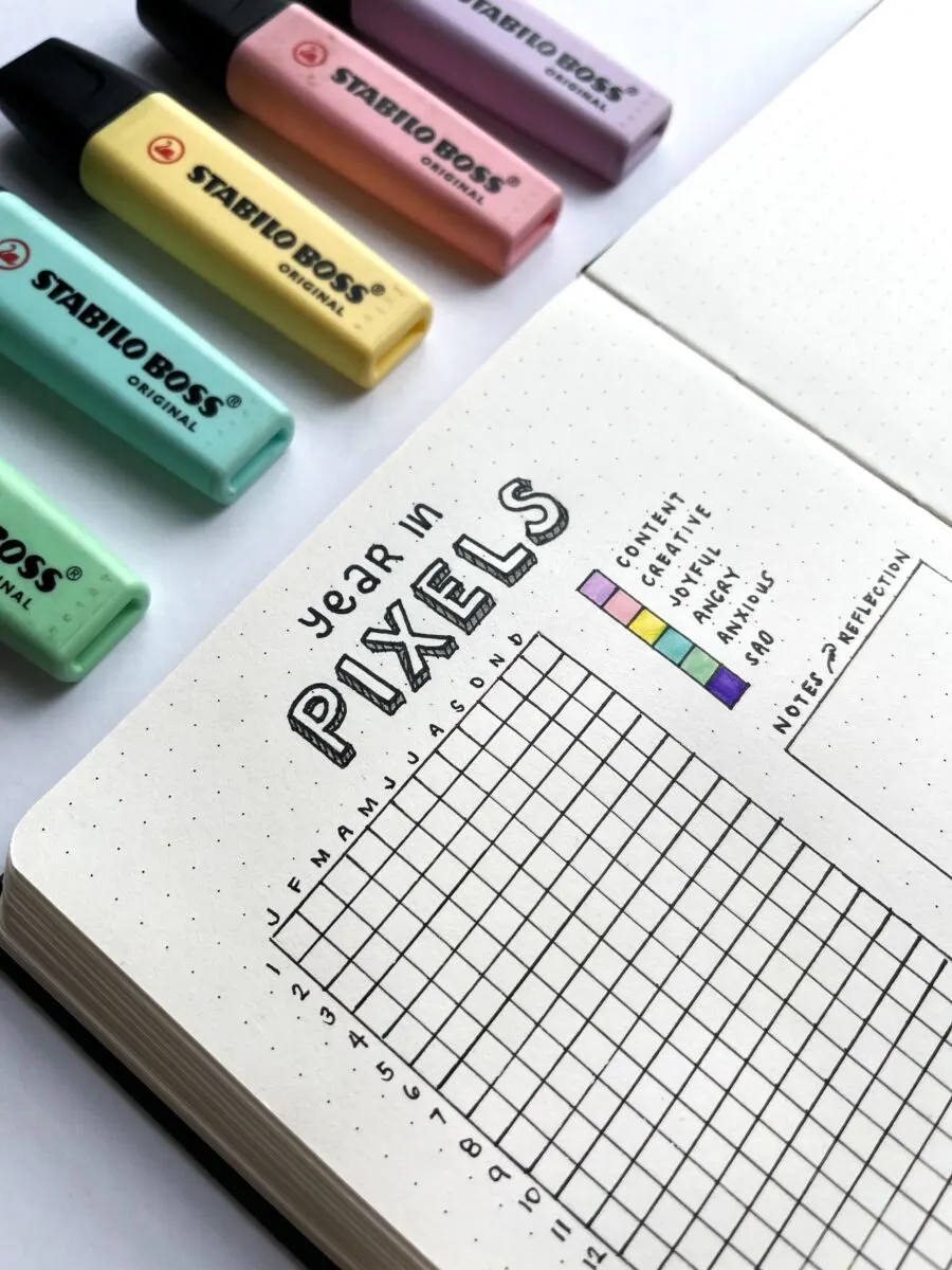
The photo shows a journal notebook with a page drawn with a table and entitled “Year in Pixels” above it. The table has small color-shaded squares according to the key representing different emotions/moods.
The color purple represents feeling “content”. Pink represents feeling “creative”. Yellow represents feeling “joyful”. Light blue represents feeling “angry”. Green represents feeling “anxious”, and navy blue represents feeling “sad”.
Above the notebook lay five Stabilo Boss highlighter pens. From left to right, the colors are pink, purple, yellow, light blue, and green.

